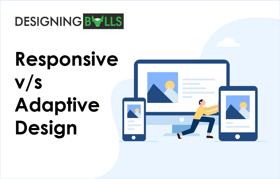
Content is like a fluid. Just like you put water into a cup, it becomes the cup, when you put it into a glass, it becomes glass. When you read content on the laptop, it gives a different look and when you read on mobile, it changes according to mobile layout. Every designer needs to create websites according to the different layout on visitors’ visits. Choosing the right design will not only give power to your website but also gives you conversions and brand image. The challenge is which design is the best one between responsive and adaptive. Well, both are good in their way, you have the option to choose the right one for your website.
Responsive Design
Responsive design is an approach to web design that makes web pages, images and CSS flexible. It detects the screen size and change layout accordingly. It prevents your readers to do that extra work. Responsiveness means when a website responds on any mobile, tablet or desktop. Bu using these technology users get the best possible view. Responsive websites are the future! It offers the best browsing experience.
Responsive designs change its width accordingly to the browser and layout size. If you open a responsive site a mobile device and change it as a desktop view it automatically change its layout dynamically. The responsive device is just like fluid, users can enjoy their online world on mobile and tablet devices better in comparison to desktop or monitors.
Adaptive design
Adaptive design is the process of creating multiple versions of web pages of a website to fit the user’s device. It is also known as Graphical User Interface (GUI) which adapts the screen size. It uses the fixed layouts, and fix it according to the screen. Adaptive design is quite different from Responsive design.
Where responsive designs are responsible for automatically change its layout according to the size of the screen, adaptive designs have multiple layouts and sizes. The website selects the appropriate layout for the screen after detecting the space available. When you open an adaptive website on the browser, it chooses the correct layout. You can design an adaptive website in 6 types of layout – 320, 480, 760, 960, 1200, 1600.
However, Responsive and Adaptive both have there own pros and cons, let’s have a look:

You must have thought that these two designs are the same. But, when you see it clearly, it has differences.
Why Adaptive Design?
Adaptive designs are used for refitting the website to make it more user-friendly. It allows you to control the designs. You can choose several layouts to create depending on your company’s budget. There are fixed 6 types of layouts but if you want to have a different one after having a research about your traffic. Like the name, they adapt to the user’s needs and situations. The responsive design shows a desktop-centric approach whereas adaptive design goes with the modern user approach. Adaptive design has several advantages like it can build best UX, sense the user environment and its needs and adapt accordingly and it can optimize advertisements. On another hand, it also has its cons, it is labor-intensive, it consists of configuration trouble, it also goes with challenging SEO.
If you want to design an Adaptive website, it’s okay. You can create it by starting from the lowest resolution (320) and up. It can be quite extra work and time consuming for you. If you have a good budget, don’t miss the Adaptive Design.
Why Responsive Design?
Responsive designs are easy to implement and much less time-consuming. It consists of less control on screen resolutions and sizes but it is the preferred design for today. There is a large number of templates available on the Content Management System (CMS) like WordPress. It consists to create a single design that can be used on any screen. This makes the user happy because it can respond to any screen size and design. Its main aim is uniformity and the best user-experience. Websites that are running on responsive design are more tend to become SEO friendly and get rank on Google.
Google always recommends Responsive Web Designs (RWD).
The Responsive designs have their disadvantages which includes, less control over website layout, there are the movement of elements, lost of ads, etc but also have pros, as it goes with good UX, more SEO friendly and easy to implement. Relevant to this design let’s have a look at some Responsive design statistics:

What to Choose?
Choose between responsive design and adaptive design requires a study. But for now, you can see responsive designs are less in cost, less time consuming, better in SEO and have better user experience, you can go with this one. Responsive design is go-to-designs in today’s world. It will remain popular and recommended.
Thanks for Reading. Like this article?Don't forget to share. 🙂


Pingback: Website - An Expense or an Investment? - Designing Bulls