
How irritating it is when you open a website on a mobile device and you have to shrink it to make it responsive. Do you like a website that you have to pinch and zoom? It is likely not a good experience. Ask, Is your Website mobile-friendly? Your website needs to be user-friendly on a mobile device.
If you’re not a web designer you might be thinking what is user-friendly means. You’ll get clear for sure throughout this article.
The fact is 40% of users have gone from the website when they found that it is not responsive.
Is your Website Mobile-Friendly? If your website is not mobile responsive, it may lose a number of leads and sales.
Although, people like searching through desktop, mobile devices have made a lot of places in the market.

Statistica reports show that 63 % of online traffic comes from smartphones and tablets.
And, 58% of searches are mobile device based accounting for nearly 56% of total clicks.
Mobile devices generated almost 48 % of global website traffic and consistently drifting around the 50% mark at the beginning of 2017.
And, now in 2019, it is 63%.
Now, what is the conclusion of all the facts and figures is you have to make a website that if fully responsive if you want to grow in the industry faster and pace to competition.
Let’s come to the point that What is responsiveness?
Before we come at the point, Is your Website Mobile-Friendly? Let’s know what is mobile-friendly and responsiveness. The word responsiveness simply means which can respond quickly or instantly. You don’t have to make changes after that. It is a technology through which a website automatically sets the visual experience according to the size of the screen on which the user is searching for something.
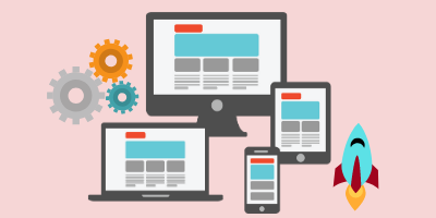
A Fully responsive website is the future. This feature allows your website to adapt to the design or layout when you search it on desktop or mobile devices. It allows visitors to see your website in the best possible and effective way which leads to profit to you and your business.
A good website includes great design, consistency, colors, typography, visuals, simplicity and functionality which is responsiveness.
You need to create your website optimized for user experience and make it easy to use. The Designing Bulls itself is also a mobile responsive and user –friendly website. When you see it on mobile devices, tablets or desktop you will see how it adapts the layout of the screen size to give you a better experience.
People who search on the go have a different aspect than the people who are sitting on the desk. A complete mobile-friendly website reorganizes them completely according to the layout of where it is getting views. Desktop gets a large view of the website including large images and animation while smartphones get a simplified layout. A responsive website is completely ready to view that the user does not have to ‘pinch and zoom’ it.
Mobile devices need simpler navigation, reliable content and faster page speed. Responsive design is a technology that makes the present and future faster. This means that your website will work in next year’s technology as well.
Now, a good responsive website comes from a good responsive theme.
What is a responsive theme?
A responsive theme smoothly works out and adjust the layout of the screen size and gives the user the better experience they wish for. It offers readability and effectiveness on small screens like mobile or smartphones.

A responsive theme follows the approach of responsiveness which offers better user-experience and mobile-friendly websites according to the screen resolutions. When you make a website with such a responsive theme you don’t have to worry after that and don’t have to adjust the layout of the screen. If a large no of visitors is visiting on your website then you have to seriously consider this and redesign your website before you found a loss in the traffic.
“Responsive web design offers us a way forward, finally allowing us to design for the ebb and flow of things.”
Ethan Marcotte
Importance of mobile responsive themes!
A responsive design can solve a lot of problems :
- Increase reach to the customers who have mobile devices instead of desktops or laptops.
- It leads to user consistency that leads to huge sales
- You can track and analysis in one place
- Time and cost-effective
- Better user – experience
- Future friendly
- Text that is readable, no need to zoom
- Content which fits the device screen resolution
- Great page speed
- Flexibility
- Search Engine Optimization
- Easy to use and managing
We live in a multi-screen world. Everything is instant nowadays. It’s important that your website must be designed in a way that it can be viewable through as many devices as possible.
Why should you use a responsive website?
#1. There was a time when the user used to create 2 types of websites. One for desktop and another for mobile. A lot of people still do the same today. Nowadays, you just have to make mobile-friendly websites that are ready to view in any device. It gives the user that flexibility to scroll the website on the screen. This makes the customer stay on your website for a long time and this is what you would like.
#2. Another advantage of having a user-friendly website is it lowers the maintenance cost and is cost-effective. You don’t have to make the two versions of the website. Make it responsive and it does all the work. It will save your time, money and energy too. It will be easier to maintain a single website and it doesn’t cost too much. You can also handle your website from any device.
#3. It provides the user with a better experience. This is the greatest benefit of having a responsive one. If your website is not responsive then it surely distorts the visuality or layout and it gives poor feedback to you. It makes text jumbles, images not properly positioned and so on. But instead of that, when you make a responsive website, it adapts the screen size automatically and gives all the love to the user.
#4. Responsive websites also lead to a higher ranking on search engines. Let me tell you that ‘Google recommends a responsive website design’. It makes a great user experience and improves your SEO. It helps you in great maintenance time and covert more customers to you.
So, it is all about the question, Is your Website Mobile-Friendly? You don’t need to worry about all above that. If you are interested in how responsive design can change your website completely and help your brand to boost up, you can contact Designing Bulls now.
Thanks for Reading. Like this article?Don't forget to share. 🙂